tiptap-advanced
Customize Existing Extension
One of the strengths of Tiptap is its extendability. You don’t depend on the provided extensions, it is intended to extend the editor to your liking.
With custom extensions you can add new content types and new functionalities, on top of what already exists or from scratch.
Extend Existing Extension
A tiptap extension is consistent of an object, you can extend or override any filed of the object to custom your extension. The object is looking like below:
- name
- priority
- custom schema
- configure html attribute in extension config, add or cover
- global attributes: Attributes can be applied to multiple extensions at once. That’s useful for text alignment, line height, color, font family, and other styling related attributes.
- renderHtml: control how an extension is rendered to HTML
- parseHtml: defined what a html tag will be consider as a extension nodeView
- keyboard shortcuts
- Input rules: be able to support for markdown
- extension with event
- add proseMirror plugin
- To hook into events, for example a click, double click or when content is pasted, you can pass event handlers to
editorPropson the editor. - complex node: There is a whole lot to learn about node views, so head over to the dedicated section in our guide about node views for more information. If you are looking for a real-world example, look at the source code of the
TaskItemnode. This is using a node view to render the checkboxes. - Sharing When everything is working fine, don’t forget to share it with the community.
Every extension has an extend() method, which takes an object with everything you want to change or add to it.
e.g.
Let’s say, you’d like to change the keyboard shortcut for the bullet list. You should start with looking at the source code of the extension, in that case the BulletList node. For the bespoken example to overwrite the keyboard shortcut, your code could look like that:
// 1. Import the extension
import BulletList from '@tiptap/extension-bullet-list'

// 2. Overwrite the keyboard shortcuts
const CustomBulletList = BulletList.extend({
  addKeyboardShortcuts() {
    return {
      'Mod-l': () => this.editor.commands.toggleBulletList(),
    }
  },
})

// 3. Add the custom extension to your editor
new Editor({
  extensions: [
    CustomBulletList(),
    // …
  ],
})
The same applies to every aspect of an existing extension, except to the name. Let’s look at all the things that you can change through the extend method. We focus on one aspect in every example, but you can combine all those examples and change multiple aspects in one extend() call too.
Some Top Level Extension Filed
Name
The extension name is used in a whole lot of places and changing it isn’t too easy. If you want to change the name of an existing extension, you can copy the whole extension and change the name in all occurrences.
The extension name is also part of the JSON. If you store your content as JSON, you need to change the name there too.
The places where use name as magic string:
Priority
The priority defines the order in which extensions are registered. The default priority is 100, that’s what most extension have. Extensions with a higher priority will be loaded earlier.
import Link from '@tiptap/extension-link'

const CustomLink = Link.extend({
  priority: 1000,
})
The order in which extensions are loaded influences two things:
- Plugin order: ProseMirror plugins of extensions with a higher priority will run first.
- Schema order: The
Linkmark for example has a higher priority, which means it will be rendered as<a href="…"><strong>Example</strong></a>instead of<strong><a href="…">Example</a></strong>.
Schema
tiptap works with a strict schema, which configures how the content can be structured, nested, how it behaves and many more things. You can change all aspects of the schema for existing extensions.
content filed and draggable filed are associated with schema.
Content
The default Blockquote extension can wrap other nodes, like headings. If you want to allow nothing but paragraphs in your blockquotes, set the content attribute accordingly:
// Blockquotes must only include paragraphs
import Blockquote from '@tiptap/extension-blockquote'

const CustomBlockquote = Blockquote.extend({
  content: 'paragraph*',
})
content value are type field of node extension, tiptap will automatically wrap the type tag of content in the node-view tag body
node type or group
    // content 自动包裹 p 标签
    // content: 'paragraph+',
    // content 自动包裹 h1 标签
    // content: 'heading+',
    // content  不会自动包裹标签
	// * + no suffix 分别代表着什么?
    content: 'inline',
Draggable
The schema even allows to make your nodes draggable, that’s what the draggable option is for. It defaults to false, but you can override that.
// Draggable paragraphs
import Paragraph from '@tiptap/extension-paragraph'

const CustomParagraph = Paragraph.extend({
  draggable: true,
})
That’s just two tiny examples, but the underlying ProseMirror schema is really powerful.
What’s Available in This?
Those extensions aren’t classes, but you still have a few important things available in this everywhere in the extension.
// Name of the extension, for example 'bulletList'
this.name

// Editor instance
this.editor

// ProseMirror type
this.type

// Object with all settings
this.options

// Everything that’s in the extended extension
this.parent
Referring Default Settings
All settings can be configured through the extension anyway, but if you want to change the default settings, for example to provide a library on top of Tiptap for other developers, you can do it like that:
import Heading from '@tiptap/extension-heading'

const CustomHeading = Heading.extend({
  addOptions() {
    return {
      ...this.parent?.(),
      levels: [1, 2, 3],
    }
  },
})
If you want to add an attribute to an extension and keep existing attributes, you can access them through this.parent().
In some cases, it is undefined, so make sure to check for that case, or use optional chaining this.parent?.()
const CustomTableCell = TableCell.extend({
  addAttributes() {
    return {
      ...this.parent?.(),
      myCustomAttribute: {
        // …
      },
    }
  },
})
Storage Data Within Extension
At some point you probably want to save some data within your extension instance. This data is mutable. You can access it within the extension under this.storage.
import { Extension } from '@tiptap/core'

const CustomExtension = Extension.create({
  name: 'customExtension',

  addStorage() {
    return {
      awesomeness: 100,
    }
  },

  onUpdate() {
    this.storage.awesomeness += 1
  },
})
Outside the extension you have access via editor.storage. Make sure that each extension has a unique name.
const editor = new Editor({
  extensions: [
    CustomExtension,
  ],
})

const awesomeness = editor.storage.customExtension.awesomeness
Attributes
Plain HTML Attribute
You can use attributes to store additional information in the content. Let’s say you want to extend the default Paragraph node to have different colors:
const CustomParagraph = Paragraph.extend({
  addAttributes() {
    // Return an object with attribute configuration
    return {
      color: {
        default: 'pink',
      },
    },
  },
})

// Result:
// <p color="pink">Example Text</p>
That is already enough to tell Tiptap about the new attribute, and set 'pink' as the default value. All attributes will be rendered as a HTML attribute by default, and parsed from the content when initiated.
Convert Attribute to inlineStyle
Let’s stick with the color example and assume you want to add an inline style to actually color the text. With the renderHTML function you can return HTML attributes which will be rendered in the output.
This examples adds a style HTML attribute based on the value of color:
const CustomParagraph = Paragraph.extend({
  addAttributes() {
    return {
      color: {
        default: null,
        // Take the attribute values
        renderHTML: attributes => {
          // … and return an object with HTML attributes.
          return {
            style: `color: ${attributes.color}`,
          }
        },
      },
    }
  },
})

// Result:
// <p style="color: pink">Example Text</p>
You can also control how the attribute is parsed from the HTML. Maybe you want to store the color in an attribute called data-color (and not just color), here’s how you would do that:
const CustomParagraph = Paragraph.extend({
  addAttributes() {
    return {
      color: {
        default: null,
        // Customize the HTML parsing (for example, to load the initial content)
        parseHTML: element => element.getAttribute('data-color'),
        // … and customize the HTML rendering.
        renderHTML: attributes => {
          return {
            'data-color': attributes.color,
            style: `color: ${attributes.color}`,
          }
        },
      },
    }
  },
})

// Result:
// <p data-color="pink" style="color: pink">Example Text</p>
You can completely disable the rendering of attributes with rendered: false.
Global Attributes
Attributes can be applied to multiple extensions at once. That’s useful for text alignment, line height, color, font family, and other styling related attributes.
Take a closer look at the full source code of the TextAlign extension to see a more complex example. But here is how it works in a nutshell:
import { Extension } from '@tiptap/core'

const TextAlign = Extension.create({
  addGlobalAttributes() {
    return [
      {
        // Extend the following extensions
        types: [
          'heading',
          'paragraph',
        ],
        // … with those attributes
        attributes: {
          textAlign: {
            default: 'left',
            renderHTML: attributes => ({
              style: `text-align: ${attributes.textAlign}`,
            }),
            parseHTML: element => element.style.textAlign || 'left',
          },
        },
      },
    ]
  },
})
Render Html
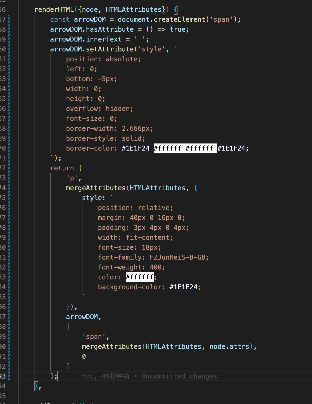
With the renderHTML function you can control how an extension is rendered to HTML. We pass an attributes object to it, with all local attributes, global attributes, and configured CSS classes. Here is an example from the Bold extension:
renderHTML({ HTMLAttributes }) {
  return ['strong', HTMLAttributes, 0]
},
The first value in the array should be the name of HTML tag. If the second element is an object, it’s interpreted as a set of attributes. Any elements after that are rendered as children.
The number zero (representing a hole) is used to indicate where the content should be inserted. Let’s look at the rendering of the CodeBlock extension with two nested tags:
renderHTML({ HTMLAttributes }) {
  return ['pre', ['code', HTMLAttributes, 0]]
},
If you want to add some specific attributes there, import the mergeAttributes helper from @tiptap/core:
import { mergeAttributes } from '@tiptap/core'

// ...

renderHTML({ HTMLAttributes }) {
  return ['a', mergeAttributes(HTMLAttributes, { rel: this.options.rel }), 0]
},
Render Multi Children
enderHTML({ HTMLAttributes }) {
		const { href, target, style, width, ...imgAttrs } = HTMLAttributes;

		return [
			'figure',
			{
				style,
				contenteditable: true,
			},
			[
				'a',
				{
					href,
					target,
				},
				[
					'img', mergeAttributes(imgAttrs, { draggable: false, contenteditable: false, width }),
				],
			],
			['figcaption', 0],
		];
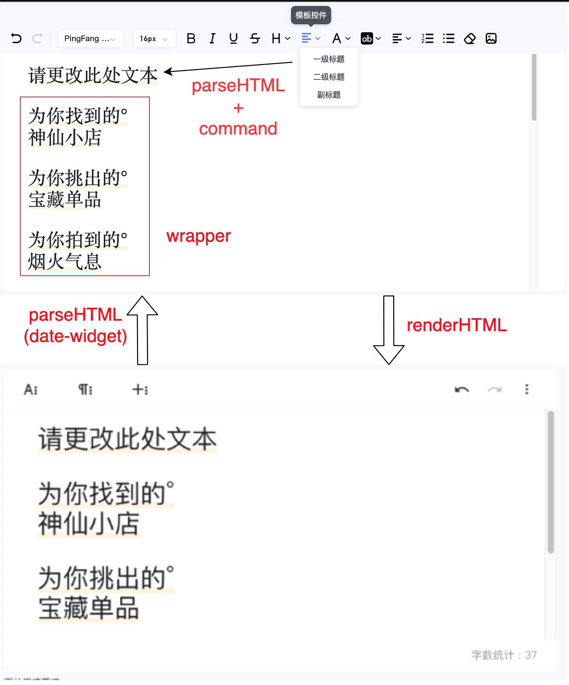
Parse Html
The parseHTML() function tries to load the editor document from HTML. The function gets the HTML DOM element passed as a parameter, and is expected to return an object with attributes and their values. Here is a simplified example from the Bold mark:
parseHTML() {
  return [
    {
      tag: 'strong',
    },
  ]
},
This defines a rule to convert all <strong> tags to Bold marks. But you can get more advanced with this, here is the full example from the extension:
parseHTML() {
  return [
    // <strong>
    {
      tag: 'strong',
    },
    // <b>
    {
      tag: 'b',
      getAttrs: node => node.style.fontWeight !== 'normal' && null,
    },
    // <span style="font-weight: bold"> and <span style="font-weight: 700">
    {
      style: 'font-weight',
      getAttrs: value => /^(bold(er)?|[5-9]\d{2,})$/.test(value as string) && null,
    },
  ]
},
This checks for <strong> and <b> tags, and any HTML tag with an inline style setting the font-weight to bold.
As you can see, you can optionally pass a getAttrs callback, to add more complex checks, for example for specific HTML attributes. The callback gets passed the HTML DOM node, except when checking for the style attribute, then it’s the value.
You are wondering what’s that && null doing? ProseMirror expects null or undefined if the check is successful.
When it returns null or undefined, that is interpreted as an empty/default set of attributes.
null 相当于是返回所有的 attrs
Pass priority to a rule to resolve conflicts with other extensions, for example if you build a custom extension which looks for paragraphs with a class attribute, but you already use the default paragraph extension.
Using GetAttrs
The getAttrs function you’ve probably noticed in the example has two purposes:
- Check the HTML attributes to decide whether a rule matches (and a mark or node is created from that HTML). When the function returns
false, it’s not matching. - Get the DOM Element and use the HTML attributes to set your mark or node attributes accordingly:
parseHTML() {
  return [
    {
      tag: 'span',
      getAttrs: element => {
        // Check if the element has an attribute
        element.hasAttribute('style')
        // Get an inline style
        element.style.color
        // Get a specific attribute
        element.getAttribute('data-color')
      },
    },
  ]
},
You can return an object with the attribute as the key and the parsed value to set your mark or node attribute. We would recommend to use the parseHTML inside addAttributes(), though. That will keep your code cleaner.
addAttributes() {
  return {
    color: {
      // Set the color attribute according to the value of the `data-color` attribute
      parseHTML: element => element.getAttribute('data-color'),
    }
  }
},
Read more about getAttrs and all other ParseRule properties in the ProseMirror reference.
Are Element Rendered?
parseHTML provided a dom-like api such as querySelectorAll to parse html string
or all element rendered by browser and then prosemirror parse the real dom ?
I think the first one make more sense
Commands
import Paragraph from '@tiptap/extension-paragraph'

const CustomParagraph = Paragraph.extend({
  addCommands() {
    return {
      paragraph: () => ({ commands }) => {
        return commands.setNode('paragraph')
      },
    }
  },
})
Use the commands parameter inside of addcommands. To access other commands inside addCommands use the commands parameter that’s passed to it.
Focus
May the focus command always pay the cursor at the last focus point?
Keyboard Shortcuts
Most core extensions come with sensible keyboard shortcut defaults. Depending on what you want to build, you’ll likely want to change them though. With the addKeyboardShortcuts() method you can overwrite the predefined shortcut map:
// Change the bullet list keyboard shortcut
import BulletList from '@tiptap/extension-bullet-list'

const CustomBulletList = BulletList.extend({
  addKeyboardShortcuts() {
    return {
      'Mod-l': () => this.editor.commands.toggleBulletList(),
    }
  },
})
Input Rules
With input rules you can define regular expressions to listen for user inputs. They are used for markdown shortcuts, or for example to convert text like (c) to a © (and many more) with the Typography extension. Use the markInputRule helper function for marks, and the nodeInputRule for nodes.
By default text between two tildes on both sides is transformed to striked text. If you want to think one tilde on each side is enough, you can overwrite the input rule like this:
// Use the ~single tilde~ markdown shortcut
import Strike from '@tiptap/extension-strike'
import { markInputRule } from '@tiptap/core'

// Default:
// const inputRegex = /(?:^|\s)((?:~~)((?:[^~]+))(?:~~))$/

// New:
const inputRegex = /(?:^|\s)((?:~)((?:[^~]+))(?:~))$/

const CustomStrike = Strike.extend({
  addInputRules() {
    return [
      markInputRule({
        find: inputRegex,
        type: this.type,
      }),
    ]
  },
})
Paste Rules
Paste rules work like input rules (see above) do. But instead of listening to what the user types, they are applied to pasted content.
There is one tiny difference in the regular expression. Input rules typically end with a $ dollar sign (which means “asserts position at the end of a line”), paste rules typically look through all the content and don’t have said $ dollar sign.
Taking the example from above and applying it to the paste rule would look like the following example.
// Check pasted content for the ~single tilde~ markdown syntax
import Strike from '@tiptap/extension-strike'
import { markPasteRule } from '@tiptap/core'

// Default:
// const pasteRegex = /(?:^|\s)((?:~~)((?:[^~]+))(?:~~))/g

// New:
const pasteRegex = /(?:^|\s)((?:~)((?:[^~]+))(?:~))/g

const CustomStrike = Strike.extend({
  addPasteRules() {
    return [
      markPasteRule({
        find: pasteRegex,
        type: this.type,
      }),
    ]
  },
})
Events
You can even move your event listeners to a separate extension. Here is an example with listeners for all events:
import { Extension } from '@tiptap/core'

const CustomExtension = Extension.create({
  onCreate() {
    // The editor is ready.
  },
  onUpdate() {
    // The content has changed.
  },
  onSelectionUpdate({ editor }) {
    // The selection has changed.
  },
  onTransaction({ transaction }) {
    // The editor state has changed.
  },
  onFocus({ event }) {
    // The editor is focused.
  },
  onBlur({ event }) {
    // The editor isn’t focused anymore.
  },
  onDestroy() {
    // The editor is being destroyed.
  },
})
Prosemirror Plugins (advanced)
Prosemirror plugins (advanced)
After all, Tiptap is built on ProseMirror and ProseMirror has a pretty powerful plugin API, too. To access that directly, use addProseMirrorPlugins().
Create New Extensions
You can build your own extensions from scratch and you know what? It’s the same syntax as for extending existing extension described above.
There are three different type extension you can use:
- node, define custom html node
- markup, define custom html markup
- extension,
Create a Node
If you think of the document as a tree, then nodes are just a type of content in that tree. Good examples to learn from are Paragraph, Heading, or CodeBlock.
import { Node } from '@tiptap/core'

const CustomNode = Node.create({
  name: 'customNode',

  // Your code goes here.
})
Nodes don’t have to be blocks. They can also be rendered inline with the text, for example for @mentions.
Create a Mark
One or multiple marks can be applied to nodes, for example to add inline formatting. Good examples to learn from are Bold, Italic and Highlight.
import { Mark } from '@tiptap/core'

const CustomMark = Mark.create({
  name: 'customMark',

  // Your code goes here.
})
Create an Extension
Extensions add new capabilities to Tiptap and you’ll read the word extension here very often, even for nodes and marks. But there are literal extensions. Those can’t add to the schema (like marks and nodes do), but can add functionality or change the behaviour of the editor.
A good example to learn from is probably TextAlign.
import { Extension } from '@tiptap/core'

const CustomExtension = Extension.create({
  name: 'customExtension',

  // Your code goes here.
})
Interactive Node Views
For advanced use cases, where you need to execute JavaScript inside your nodes, for example to render a sophisticated interface around an image, you need to learn about node views.
They are really powerful, but also complex. In a nutshell, you need to return a parent DOM element, and a DOM element where the content should be rendered in. Look at the following, simplified example:
nodeView 是 tiptap 中最为灵活, 强大的功能, 它可以允许我们插入可交互的 DOM 节点 (绑定了 JS 逻辑的节点). 理论上来说可以通过原生的 JS 逻辑实现任何想要的功能, 在 addNodeView 方法的最后, 你只需要返回一个 parent DOM element, 以及一个 DOM element 用于指定 nodeView 渲染的位置.
import Image from '@tiptap/extension-image'

const CustomImage = Image.extend({
  addNodeView() {
    return () => {
      const container = document.createElement('div')

      container.addEventListener('click', event => {
        alert('clicked on the container')
      })

      const content = document.createElement('div')
      container.append(content)

      return {
        dom: container,
        contentDOM: content,
      }
    }
  },
})
Node views are the best thing since sliced bread, at least if you are a fan of customization (and bread). With node views you can add interactive nodes to your editor. That can literally be everything. If you can write it in JavaScript, you can use it in your editor.
Node views are amazing to improve the in-editor experience, but can also be used in a read-only instance of Tiptap. They are unrelated to the HTML output by design, so you have full control about the in-editor experience and the output.
nodeView 可以很好的提高编辑器内的使用体验, 也可以用于只读的 tiptap 编辑器. nodeView 被设置成于 output 无关, 因此需要通过配置指定 nodeView 的 output format
Depending on what you would like to build, node views work a little bit different and can have their verify specific capabilities, but also pitfalls. The main question is: How should your custom node look like?
node views is the most difficult part of tiptap, but also the most esay part of proseMirror
Editable/non-editable Text
Editable Text
Yes, node views can have editable text, just like a regular node. That’s simple. The cursor will exactly behave like you would expect it from a regular node. Existing commands work very well with those nodes.
<div class="Prosemirror" contenteditable="true">
  <p>text</p>
  <node-view>text</node-view>
  <p>text</p>
</div>
That’s how the TaskItem node works.
Non-editable Text
Nodes can also have text, which is not editable. The cursor can’t jump into those, but you don’t want that anyway.
tiptap adds a contenteditable="false" to those by default.
<div class="Prosemirror" contenteditable="true">
  <p>text</p>
  <node-view contenteditable="false">text</node-view>
  <p>text</p>
</div>
That’s how you could render mentions, which shouldn’t be editable. Users can add or delete them, but not delete single characters.
Statamic uses those for their Bard editor, which renders complex modules inside Tiptap, which can have their own text inputs.
Mixed Content
You can even mix non-editable and editable text. That’s great to build complex things, and still use marks like bold and italic inside the editable content.
BUT, if there are other elements with non-editable text in your node view, the cursor can jump there. You can improve that with manually adding contenteditable="false" to the specific parts of your node view.
<div class="Prosemirror" contenteditable="true">
  <p>text</p>
  <node-view>
    <div contenteditable="false">
      non-editable text
    </div>
    <div>
      editable text
    </div>
  </node-view>
  <p>text</p>
</div>
Markup / Output
But what happens if you access the editor content? If you’re working with HTML, you’ll need to tell Tiptap how your node should be serialized.
The editor does not export the rendered JavaScript node, and for a lot of use cases you wouldn’t want that anyway.
Let’s say you have a node view which lets users add a video player and configure the appearance (autoplay, controls …). You want the interface to do that in the editor, not in the output of the editor. The output of the editor should probably only have the video player.
I know, I know, it’s not that easy. Just keep in mind, that you‘re in full control of the rendering inside the editor and of the output.
What if You Store Json?
That doesn’t apply to JSON. In JSON, everything is stored as an object. There is no need to configure the “translation” to and from JSON.
It's that mean I cau store node view directly in JSON? No, JSON just the other form the structure.
Render Html
Okay, you’ve set up your node with an interactive node view and now you want to control the output. Even if your node view is pretty complex, the rendered HTML can be simple:
就算 nodeView 的交互非常复杂, 但是最终的 html 产物也可以很简单 o:
renderHTML({ HTMLAttributes }) {
  return ['my-custom-node', mergeAttributes(HTMLAttributes)]
},

// Output: <my-custom-node count="1"></my-custom-node>
Make sure it’s something distinguishable, so it’s easier to restore the content from the HTML. If you just need something generic markup like a <div> consider to add a data-type="my-custom-node".
Is it mean that no matter what tag I render, I can render it to totally diffierent tag name by the 0 element
Parse Html
The same applies to restoring the content. You can configure what markup you expect, that can be something completely unrelated to the node view markup. It just needs to contain all the information you want to restore.
Attributes are automagically restored, if you registered them through addAttributes.
// Input: <my-custom-node count="1"></my-custom-node>

parseHTML() {
  return [{
    tag: 'my-custom-node',
  }]
},
Render javascript/vue/react
But what if you want to render your actual JavaScript/Vue/React code? Consider using Tiptap to render your output. Just set the editor to editable: false and no one will notice you’re using an editor to render the content. :-)
The Node Attribute is Important
the standard place for HTML element to store data.
where the node attribute will be, especially in a complex node.
nodeViewContent
如果没有使用 nodeViewContent 组件, 那么一次 update 之后, nodeView 的 content 就会变成空.
并且 renderText 的时候, 默认会把 renderText() + nodeViewContent
Node Views with Javascript
A nodeView must be a node type extension?
Yes
Here is what you need to do to render a node view inside your editor:
- Create a node extension
- Register a new node view with
addNodeView() - Write your render function
- Configure Tiptap to use your new node extension
This is how your node extension could look like:
import { Node } from '@tiptap/core'
import Component from './Component.vue'

export default Node.create({
  // configuration …

  addNodeView() {
    return ({ editor, node, getPos, HTMLAttributes, decorations, extension }) => {
      const dom = document.createElement('div')

      dom.innerHTML = 'Hello, I’m a node view!'

      return {
        dom,
      }
    }
  },
})
Access Node Attributes
The editor passes a few helpful things to your render function. One of them is the node prop. This one enables you to access node attributes in your node view. Let’s say you have added an attribute named count to your node extension. You could access the attribute like this:
addNodeView() {
  return ({ node }) => {
    console.log(node.attrs.count)

    // …
  }
}
Update Node Attributes
You can even update node attributes from your node view, with the help of the getPos prop passed to your render function. Dispatch a new transaction with an object of the updated attributes:
addNodeView() {
  return ({ editor, node, getPos }) => {
    const { view } = editor

    // Create a button …
    const button = document.createElement('button')
    button.innerHTML = `This button has been clicked ${node.attrs.count} times.`

    // … and when it’s clicked …
    button.addEventListener('click', () => {
      if (typeof getPos === 'function') {
        // … dispatch a transaction, for the current position in the document …
        view.dispatch(view.state.tr.setNodeMarkup(getPos(), undefined, {
          count: node.attrs.count + 1,
        }))

        // … and set the focus back to the editor.
        editor.commands.focus()
      }
    })

    // …
  }
}
Does seem a little bit too complex? Consider using React or Vue, if you have one of those in your project anyway. It get’s a little bit easier with those two.
Adding a Content Editable
To add editable content to your node view, you need to pass a contentDOM, a container element for the content. Here is a simplified version of a node view with non-editable and editable text content:
// Create a container for the node view
const dom = document.createElement('div')

// Give other elements containing text `contentEditable = false`
const label = document.createElement('span')
label.innerHTML = 'Node view'
label.contentEditable = false

// Create a container for the content
const content = document.createElement('div')

// Append all elements to the node view container
dom.append(label, content)

return {
  // Pass the node view container …
  dom,
  // … and the content container:
  contentDOM: content,
}
Got it? You’re free to do anything you like, as long as you return a container for the node view and another one for the content. Here is the above example in action
what's the different between dom and contentDOM ?
dom will be render as contenteditable = false
contentDom will be editable
Keep in mind that this content is rendered by Tiptap. That means you need to tell what kind of content is allowed, for example with content: 'inline*' in your node extension (that’s what we use in the above example).
Node Views with React/Vue/San
Node views with React – Tiptap Editor
Here is what you need to do to render React components inside your editor:
- Create a node extension
- Create a React component
- Pass that component to the provided
ReactNodeViewRenderer - Register it with
addNodeView() - Configure Tiptap to use your new node extension
This is how your node extension could look like:
import { Node } from '@tiptap/core'
import { ReactNodeViewRenderer } from '@tiptap/react'
import Component from './Component.jsx'

export default Node.create({
  // configuration …

  addNodeView() {
    return ReactNodeViewRenderer(Component)
  },
})
There is a little bit of magic required to make this work. But don’t worry, we provide a wrapper component you can use to get started easily. Don’t forget to add it to your custom React component, like shown below:
<NodeViewWrapper className="react-component">
  React Component
</NodeViewWrapper>
Got it? Let’s see it in action. Feel free to copy the below example to get started.
That component doesn’t interact with the editor, though. Time to wire it up.
in this case, the component tag is magic string, We must write the react-component tag, for the extension to parse and render.
通过 as 把标签的逻辑 包装在 extension 内?
Access Node Attributes
The ReactNodeViewRenderer which you use in your node extension, passes a few very helpful props to your custom React component. One of them is the node prop. Let’s say you have added an attribute named count to your node extension (like we did in the above example) you could access it like this:
props.node.attrs.count
Update Node Attributes
You can even update node attributes from your node, with the help of the updateAttributes prop passed to your component. Pass an object with updated attributes to the updateAttributes prop:
export default props => {
  const increase = () => {
    props.updateAttributes({
      count: props.node.attrs.count + 1,
    })
  }

  // …
}
And yes, all of that is reactive, too. A pretty seamless communication, isn’t it?
As Tag Name
The NodeViewWrapper and NodeViewContent components render a <div> HTML tag (<span> for inline nodes), but you can change that. For example <NodeViewContent as="p"> should render a paragraph. One limitation though: That tag must not change during runtime.
Dragging
To make your node views draggable, set draggable: true in the extension and add data-drag-handle to the DOM element that should function as the drag handle.
Node View with Lib
Editor 和 EditorContent
以组件的形式把 editor 实例和视图进行了绑定.
editor 的内容都渲染到组件里面去, 所以:
- editor 需要一个 contentComponent 字段, 用来保存视图组件
- 视图组件初始化时需要绑定 editor
这两个都是比较简洁的, 就是加了一些字段, 包装了一下而已.
NodeViewWrapper
作为 addNodeView 方法中的 dom 字段返回值, 本质上就是带着所有组件视图的父节点, 把这个节点返回给 editor 进行插入
NodeViewContent
与 nodeViewWrapper 类似的一个组件, 功能是提供一个可以编辑器的区域.
用来放置 标签内的东西, 相当于放置 innetHTML
NodeViewRenderer
ReactNodeViewRenderer(component, options)
通过闭包保存了传入的 component 和 options, 真正的作用是在 extension addNodeView 时被调用, 会执行 component 的渲染操作, 最终把组件的渲染结果, 也就是 HTMLElement 作为 addNodeView 的返回值返回
与 addNodeView 方法直接交互, 获取并透传 editor 相关的 props, 负责返回 dom 和 contentDom
Renderer
作用就是执行组件的渲染, 获取 HTMLElement
和 component 强相关的, 调用了 component 的 attach 方法
需要关注的是组件 props, 和实际渲染的标签名, 经过多次透传, 我已经晕了, 到底这里获取到的是什么 props
As
as 字段一直没有很好的处理, 按道理来讲, 可以通过 san.defiendComponent 动态的常见组件, 并进行注册,
但是 vue 一直没有看到这个操作, 说不定是不需要的, 后面再慢慢看吧
decorationClasses 也是一个看不懂的字段
Markdown Link
import { InputRule, markInputRule, markPasteRule, PasteRule } from '@tiptap/react';
import { Link } from '@tiptap/extension-link';
import type { LinkOptions } from '@tiptap/extension-link';
/**
 * The input regex for Markdown links with title support, and multiple quotation marks (required
 * in case the `Typography` extension is being included).
 */
const inputRegex = /(?:^|\s)\[([^\]]*)?\]\((\S+)(?: ["“](.+)["”])?\)$/i;
/**
 * The paste regex for Markdown links with title support, and multiple quotation marks (required
 * in case the `Typography` extension is being included).
 */
const pasteRegex = /(?:^|\s)\[([^\]]*)?\]\((\S+)(?: ["“](.+)["”])?\)/gi;
/**
 * Input rule built specifically for the `Link` extension, which ignores the auto-linked URL in
 * parentheses (e.g., `(https://doist.dev)`).
 *
 * @see https://github.com/ueberdosis/tiptap/discussions/1865
 */
function linkInputRule(config: Parameters<typeof markInputRule>[0]) {
  const defaultMarkInputRule = markInputRule(config);
  return new InputRule({
    find: config.find,
    handler(props) {
      const { tr } = props.state;
      defaultMarkInputRule.handler(props);
      tr.setMeta('preventAutolink', true);
    },
  });
}
/**
 * Paste rule built specifically for the `Link` extension, which ignores the auto-linked URL in
 * parentheses (e.g., `(https://doist.dev)`). This extension was inspired from the multiple
 * implementations found in a Tiptap discussion at GitHub.
 *
 * @see https://github.com/ueberdosis/tiptap/discussions/1865
 */
function linkPasteRule(config: Parameters<typeof markPasteRule>[0]) {
  const defaultMarkPasteRule = markPasteRule(config);
  return new PasteRule({
    find: config.find,
    handler(props) {
      const { tr } = props.state;
      defaultMarkPasteRule.handler(props);
      tr.setMeta('preventAutolink', true);
    },
  });
}
/**
 * Custom extension that extends the built-in `Link` extension to add additional input/paste rules
 * for converting the Markdown link syntax (i.e. `[Doist](https://doist.com)`) into links, and also
 * adds support for the `title` attribute.
 */
const RichTextLink = Link.extend({
  inclusive: false,
  addAttributes() {
    return {
      ...this.parent?.(),
      title: {
        default: null,
      },
    };
  },
  addInputRules() {
    return [
      linkInputRule({
        find: inputRegex,
        type: this.type,
        // We need to use `pop()` to remove the last capture groups from the match to
        // satisfy Tiptap's `markPasteRule` expectation of having the content as the last
        // capture group in the match (this makes the attribute order important)
        getAttributes(match) {
          return {
            title: match.pop()?.trim(),
            href: match.pop()?.trim(),
          };
        },
      }),
    ];
  },
  addPasteRules() {
    return [
      linkPasteRule({
        find: pasteRegex,
        type: this.type,
        // We need to use `pop()` to remove the last capture groups from the match to
        // satisfy Tiptap's `markInputRule` expectation of having the content as the last
        // capture group in the match (this makes the attribute order important)
        getAttributes(match) {
          return {
            title: match.pop()?.trim(),
            href: match.pop()?.trim(),
          };
        },
      }),
    ];
  },
});
export { RichTextLink };
export type { LinkOptions as RichTextLinkOptions };
Inline Node View
参考 customLink, 基本已经没有 bug 了
import { mergeAttributes, Node, ReactNodeViewRenderer, wrappingInputRule } from '@tiptap/react';
import { LinkComponent } from './component';

export interface CustomLinkOptions {
  HTMLAttributes: {
    href: string;
    target: string;
    rel: string;
    class: string;
    title: string;
  };
}

export const inputRegex = /(?:^|\s)\[([^\]]*)?\]\((\S+)(?: ["“](.+)["”])?\)$/i;

export const CustomLink = Node.create<CustomLinkOptions>({
  name: 'custom-link',
  group: 'inline',
  inline: true,
  content: 'text*',
  atom: true,

  addOptions() {
    return {
      HTMLAttributes: {
        target: '_blank',
        rel: 'noopener noreferrer nofollow',
        class: '',
        href: '',
        title: '',
      },
    };
  },

  addAttributes() {
    return {
      href: {
        default: null,
      },
      target: {
        default: this.options.HTMLAttributes.target,
      },
      rel: {
        default: this.options.HTMLAttributes.rel,
      },
      class: {
        default: this.options.HTMLAttributes.class,
      },
      title: {
        default: this.options.HTMLAttributes.title,
      },
    };
  },
  parseHTML() {
    return [{ tag: 'a[href]:not([href *= "javascript:" i])' }];
  },

  renderHTML({ HTMLAttributes }) {
    // False positive; we're explicitly checking for javascript: links to ignore them
    // eslint-disable-next-line no-script-url
    if (HTMLAttributes.href?.startsWith('javascript:')) {
      // strip out the href
      return ['a', mergeAttributes(this.options.HTMLAttributes, { ...HTMLAttributes, href: '' }), 0];
    }
    return ['a', mergeAttributes(this.options.HTMLAttributes, HTMLAttributes), 0];
  },

  addNodeView() {
    return ReactNodeViewRenderer(LinkComponent, {
      attrs: {
        contenteditable: 'false',
      },
    });
  },

  /**
   * group: 'block',
   * content: 'paragraph block*',
   * 时才能生效, 不知道为什么
   */
  addInputRules() {
    return [
      wrappingInputRule({
        find: inputRegex,
        type: this.type,
        getAttributes(match) {
          // We need to use `pop()` to remove the last capture groups from the match to
          // satisfy Tiptap's `markPasteRule` expectation of having the content as the last
          // capture group in the match (this makes the attribute order important)
          // md 语法中的可选 title. 暂时用不上
          const optionalTitle = match.pop()?.trim();
          return {
            // title: match.pop()?.trim(),
            href: match.pop()?.trim(),
            title: match.pop()?.trim(),
          };
        },
      }),
    ];
  },
});