grid
https://juejin.im/post/59c722b35188257a125d7960#heading-27
https://developer.mozilla.org/zh-CN/docs/Web/CSS/CSS_Grid_Layout/Basic_Concepts_of_Grid_Layout
https://developer.mozilla.org/zh-CN/docs/Web/CSS/CSS_Grid_Layout/Relationship_of_Grid_Layout
https://developer.mozilla.org/zh-CN/docs/Web/CSS/CSS_Grid_Layout/Box_Alignment_in_CSS_Grid_Layout
二维布局模型
Grid Layout 叫栅格布局模型,因为几乎每一个成熟的 CSS 框架都会实现自己的栅格布局系统,所以 W3C 干脆弄了一套 CSS 原生的栅格布局系统,补足这方面的短板。
有那么一段时间,网页布局是表格的天下。用表格布局虽然怪怪的,但是表格有它自己的优势。流式布局只能一个一个元素往页面底部流动,它的表达能力是有限的;而表格把页面切成若干豆腐块,能从容调配每一块豆腐,布局表达能力秒杀流。然而表格毕竟是表格,它有一些特性是专门为制作表格准备的,所以也就逐渐式微了。
栅格布局系统,可以理解为更加通用、更加强大的表格布局系统。它也是把页面切成若干豆腐块,元素可以自由声明占用哪个豆腐块。W3C 还为 Grid Layout 增加了好多专用的属性、语法和计算函数,可以说,这一次是奔着一劳永逸来的。
当我们的视角确立以后,所谓的一维就是只有行,而所谓的二维就是有行也有列。很好理解,既然是栅格嘛,那必须得行列相交才能确定一个格子的大小。
概念
因为 Grid Layout 是二维布局模型,它干脆就固定了行与列的方向。格子嘛,任何横着放的布局方式都可以用竖着放的布局方式实现,反之亦然。所以自定义主轴的方向意义不大,于是乎 Grid Layout 也就没有主轴和交叉轴的概念。
容器与项目
Grid Layout 有栅格容器 (grid container),它负责划分领地,容器之内的元素才会受控于栅格模型;Grid Layout 也有栅格项目 (grid item),它们是需要被栅格模型约束的对象。
<div>
  <div><p>1</p></div>
  <div><p>2</p></div>
  <div><p>3</p></div>
</div>
上面代码中,最外层的 <div> 元素就是容器,内层的三个 <div> 元素就是项目。
注意:项目只能是容器的 顶层子元素,不包含项目的子元素,比如上面代码的 <p> 元素就不是项目。Grid 布局只对项目生效。
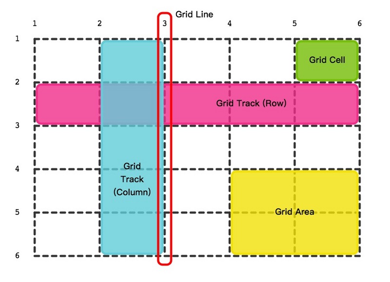
栅格线
栅格线可以理解为栅格的边框,水平和垂直的栅格线交叉形成了栅格单元。栅格线有什么作用呢?有些栅格项目可能不止占用一个栅格单元,声明的时候就可以说:我从第几条栅格线开始,到第几条栅格线结束,这块区域是老子的
你可以为栅格线命名。
正常情况下,n 行有 n + 1 根水平网格线,m 列有 m + 1 根垂直网格线,比如三行就有四根水平网格线。
栅格单元
四条栅格线合围成的最小区域就是栅格单元。它就是我们常说的格子。
需要特别区分 栅格单元 与 栅格项目。
把栅格模型类比成养猪场的话,栅格单元就是猪圈,栅格项目就是猪。但是这里的猪比较金贵,一个猪圈最多只能养一头猪。就是一个萝卜一个坑吧。
但有些猪比较肥,或者比较霸道,它可能占用不止一个猪圈。
栅格单元是格子,栅格项目是元素,有时候一个元素只需要一个格子约束它,有时候一个元素需要多个格子约束它。
容器的每个子元素会占据至少一个格子
编外栅格单元
栅格单元的数量是需要显式声明的。如果栅格项目的数量超过了声明的栅格单元的数量,Grid Layout 就会自动创建若干栅格单元来包裹那些超出的栅格项目。我们称它为编外栅格单元。
编外栅格单元有自己的特性,可以通过 grid-auto-columns、grid-auto-rows 和 grid-auto-flow 自定义。
栅格系统
栅格系统就是栅格单元的总和。
栅格系统和栅格容器不是一个概念,正如栅格单元和栅格项目不是一个概念一样。
栅格系统有可能溢出栅格容器,也可能偏居栅格容器的一隅,也可能充满栅格容器。
栅格轨道
还是回到二维布局模型,虽然我们说它有行也有列,但区分行与列的收益并不大,所以就统一叫它们栅格轨道。
正常情况下,n 行和 m 列会产生 n x m 个单元格。比如,3 行 3 列会产生 9 个单元格。
栅格区域
任意四条栅格线合围成的区域都可以成为栅格区域。当一个元素需要多个 格子 约束它的时候,我们说这个元素需要一个 栅格区域 约束它。
栅格区域可以由一个栅格单元组成,也可以有若干个栅格单元组成,但它必须是一个长方体。
栅格区域最终是要被栅格项目使用的。你可以给栅格区域命名,栅格项目用名字声明区域,或者栅格项目直接用四条栅格线确定一个区域。
容器属性
基本结构
<div class="container">
  <div class="item">
    <p class="inner">1</p>
  </div> * 6
</div>
Display
.container {
    display: grid | inline-grid | subgrid;
}
前两个属性值的区别在于容器自身应该表现为块元素还是行内元素。第三个属性值属于 CSS Grid Level 2 规范,目前 (2019 年 3 月) 还在草案阶段
注意:设为网格布局以后,容器子元素(项目)的 float、display: inline-block、display: table-cell、vertical-align 和 column-* 等设置都将失效。
grid-template-[columns|rows]
这两个属性声明的是栅格轨道的数量以及宽度。
当你声明了四个宽度值,那在这个方向上就有四条轨道,它们的宽度是你声明的值。
你也可以在声明栅格轨道的同时声明栅格线的名称。顺序就是它们的物理顺序。
属性值
-
none:默认值,这个关键字表示不明确的网格。所有的列和其大小都将由
grid-auto-columns属性隐式的指定 -
<length>:非负值的长度大小。
-
子元素会默认占满单元格
.container{
  display: grid;
  grid-template-rows:100px 100px;
  grid-template-columns:100px 100px 100px;
}
Auto
-
如果某条栅格轨道的值是
auto,默认情况下该栅格轨道会充满栅格容器的 富余空间。.container{ display: grid; grid-template-rows:100px 100px; grid-template-columns:100px auto 100px; }
-
但是如果声明了
justify-content(后面会讲到) 不为stretch,那auto会表现为以栅格项目的长度为准。 -
这是因为:网格轨道大小为
auto(且只有为auto) 时,才可以被属性align-content和justify-content拉伸
Fr
-
fr是fraction的缩写,翻译成中文是分数,多少分之一的分数。它是Grid Layout专用的长度单位。 -
它的计算公式是这样的:
- 首先减去非
fr单位的长度 - 以声明的
fr数量总和为分母,以自身声明的fr数量为分子 - 乘以富余空间为总长度,求得自身所占的长度。
.container {
  display: grid;
  grid-template-rows:100px 100px;
  grid-template-columns:100px 1fr 1fr;
}
- 首先减去非
-
优先级:比 auto 更高,auto 的富余空间会全部被 fr 占用
.container {
  display: grid;
  grid-template-rows:100px 100px;
  grid-template-columns:100px auto 1fr;
}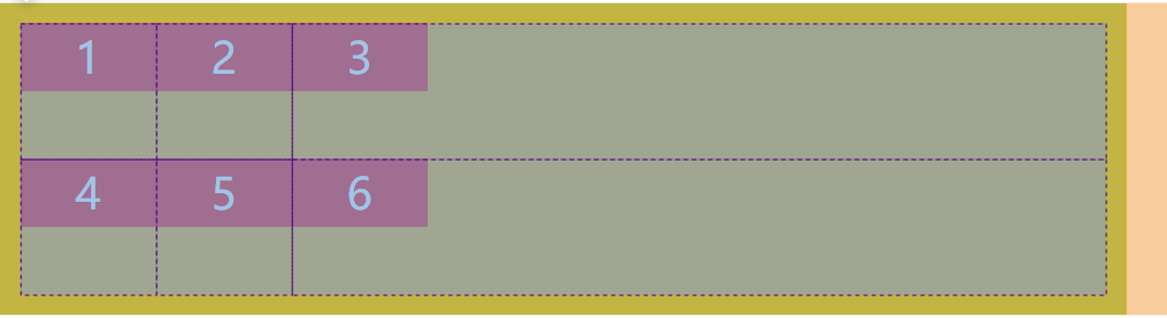
为什么 W3C 要增加一个这样的单位呢?不是有
%么?答案就在 富余空间 上。
fr也是一种百分比,但是它能保证总长度不会超过栅格容器的长度,因为它瓜分的是富余空间的长度;而%瓜分的是栅格容器的长度,不管别人瓦上霜。比如说像上面的例子,用
%可得好好算算,用fr就简单多了。
minmax()
minmax() 是 Grid Layout 专用的计算函数。
它有两个参数,分别是最小值和最大值。当栅格单元需要压缩时,最小值就是栅格项目被压缩的最小极限,当栅格单元有剩余空间时,最大值就是栅格项目扩张的最大极限。
它还有几个值需要特别提一下:
- max-content:它的值是栅格项目中的文字不换行的自然长度。
- min-content:它的值是栅格项目中的文字全部换行的自然长度。
- auto:它的值根据所处的场景介于 min-content 和 max-content 之间。
fit-content()
fit-content() 也是 Grid Layout 专用的计算函数。
它接受一个长度单位的参数。
我们已经了解过 min-content 和 max-content。
fit-content() 计算公式形象的讲,最小值是内容的 min-content,最大值则取参数和 max-content 更小的那个。
.container {
	display: grid;
	grid-template-rows:100px 100px;
	grid-template-columns:100px 100px fit-content(200px);
}
比如上面的例子,当内容小于 200px 时,以内容为长度,当内容大于 200px 时,以 200px 为长度。
repeat()
repeat() 是 Grid Layout 专用的重复函数。
它接受两个参数,第一个参数是重复的次数,第二个参数是栅格轨道的宽度。
.container{
  display: grid;
  grid-template-rows:repeat(2,100px);
  grid-template-columns:repeat(3,100px);
}
第二个参数
第二个参数不仅仅可以是宽度,它可以是一种模式。比如说 [col-start] 100px [col-end] auto,它会重复这一整段若干遍,而中括号包围的是给栅格线命名。
如此这般,第一、三、五条栅格线叫 col-start,第二、四、六条栅格线叫 col-end。总之用 repeat 函数命名栅格线会有很多重复的名字。
栅格线和栅格线的名字是怎么对应的?六条栅格轨道,就会有 7 条栅格线
.container{
  display: grid;
  grid-template-rows:repeat(2,100px);
  grid-template-columns:repeat(3,[col-start] 100px [col-end] auto);
}
除此之外,第二个参数还可以是 minmax 函数、fit-content 函数,或者 min-content、max-content、auto 关键字。
第一个参数
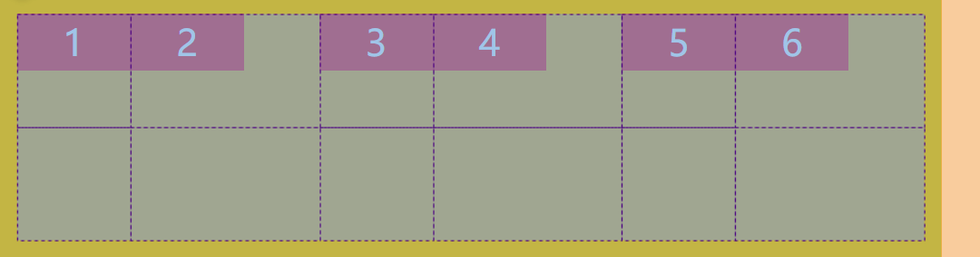
第一个参数也有两个关键字 auto-fill 和 auto-fit。
auto-fill 和 auto-fit 的共同点在于它们会保证栅格系统不溢出栅格容器。因为如果你写死了重复多少个,栅格容器空间不够的话只能溢出了。
而不同点在于,auto-fill 会生成尽可能多的栅格轨道,即便这些轨道看起来没什么用;
.container{
  display: grid;
  grid-template-rows:repeat(2,100px);
  grid-template-columns:repeat(auto-fill,100px);
}
auto-fit 则会生成尽可能少的栅格轨道,以便让那些自适应的栅格单元尽可能占用更多空间。
.container{
  display: grid;
  grid-template-rows:repeat(2,100px);
  grid-template-columns:repeat(auto-fit,100px);
}
所以区别在于,auto-fill 想让栅格轨道尽可能多,auto-fit 想让栅格单元尽可能大。@???
这两个属性是 Grid Layout 自适应布局的利器,连媒体查询都省了。
.container {
	display: grid;
	grid-template-columns: repeat(auto-fit, minmax(300px, 1fr));
}
这里的意思是说,自适应布局,每个栅格项目长度等分,但最小不低于 300px。那最大怎么确定呢?600px 到 900px 之间,一行只能放两个项目,一旦超过 900px,一行就会放三个项目。
@@@ 调整 minmax 可以体验一下 但是还是搞不懂
Grid-template-areas
这个属性给栅格单元命名,同名的栅格单元自动成为一个栅格区域。
.container {
  display: grid;
  grid-template-rows:repeat(2,100px);
  grid-template-columns: repeat(3,minmax(100px,auto));
  grid-template-areas:
    'header header header'
    'sidebar main main'
    'footer footer footer';
}
命名之后有什么用呢?栅格项目 有一个 grid-area 属性,它来瓜分栅格区域。
.item:nth-child(1){
  grid-area: header;
}
注意:header 不是 一个字符串
这个意思是说,名字叫 header 的栅格区域都是我的
命名格式
用 grid-template-columns 和 grid-template-rows 声明了多少个栅格单元,命名的时候需要名字与栅格单元一一对应起来。
并且前面说过栅格区域必须是长方体,连续命名的时候也要注意这点。
格式不对的话,结果都是一样的。所有声明了 grid-area 的项目都会在 右下角的某个编外栅格单元内,重叠在一起,尚不清楚它的算法或机制是怎样的。
.container{
  display: grid;
  grid-template-rows:repeat(2,100px);
  grid-template-columns: repeat(3,minmax(100px,auto));
  grid-template-areas:
	'header header '
	'sidebar main main'
	'footer footer footer';
}
.item:nth-child(1){
  grid-area: header;
}
命名缺省
既然语法这么严格,你要知道,取名字是一件脑壳疼的事情啊。我明明只需要给一小块区域取名字,你非得让我取满。有没有什么省事的办法呢?
当然有。不知道叫什么的时候就用 . 代替。
.contaienr{
  display: grid;
  grid-template-rows:repeat(2,100px);
  grid-template-columns: repeat(3,minmax(100px,auto));
  grid-template-areas:
	'main main sidebar'
	'main main .';
}
.item:nth-child(1){
  grid-area: main;
}
不仅如此,只要没有空格分开,n 个 . 都只占一个栅格单元。
grid-template-areas 还有一个属性值 none
.contaienr{
  grid-template-areas:
	'main main sidebar'
	'main main none';
}
.container {
	grid-template-areas: none;
}
前者声明了一个叫做 none 的栅格区域。none 是 grid-template-areas 的默认值
注意,区域的命名会影响到网格线。每个区域的起始网格线,会自动命名为 区域名-start,终止网格线自动命名为 区域名-end。
比如,区域名为 header,则起始位置的水平网格线和垂直网格线叫做 header-start,终止位置的水平网格线和垂直网格线叫做 header-end。
通过栅格线划分栅格区域
每一个栅格区域都由四条栅格线包裹,这四条线同时会被隐式的赋予名称。横向上分别是 xxx-start 和 xxx-end,纵向上也是 xxx-start 和 xxx-end。反正栅格线名字不怕多,它只怕黑,因为它是黑怕歌手。
同时呢,反过来也是成立的。
.container {
  display: grid;
  grid-template-rows: [biu-start] 1fr [nothing] 1fr [biu-end];
  grid-template-columns: [biu-start] 1fr [nothing] 1fr [biu-end] 1fr [nothing];
}
.item:nth-child(1){
  grid-area: biu;
}
上面会隐式的声明一个叫做 biu 的 栅格区域。而且发现了没有,栅格区域不可以重名,但是可以重叠。一旦重名了,该名字会失去作用,无法指向正确的栅格线
注意:网格布局允许同一根线有多个名字,比如 [fifth-line row-5]。
grid-[column|row]-gap
这个属性声明的是 栅格单元 之间的空隙
.container{
  display: grid;
  grid-template-rows: [biu-start] 1fr [nothing] 1fr [biu-end];
  grid-template-columns: [biu-start] 1fr [nothing] 1fr [biu-end] 1fr [nothing];
  grid-column-gap: 15px;
  grid-row-gap: 15px;
}
.item:nth-child(1){
  grid-area: biu;
}
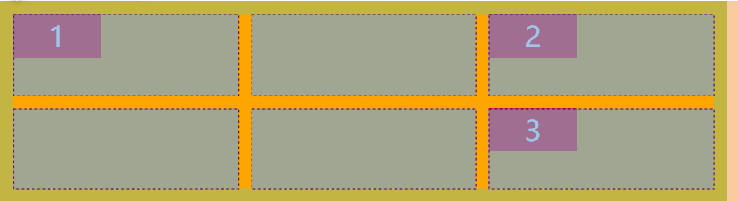
可以理解为定义的 栅格线的宽度,除去头尾的栅格线,还是说栅格线在中间,gap 均分在栅格线的两边呢?@@@
这里的值可以是任何定义 width 的值。
可以看到,如果将 grid-column-gap 设为 80%,它的意思就是 gap 占栅格容器的 80%,所有栅格单元只能分剩下的 20%。
如果将 grid-column-gap 设为 100% 或超过 100% 呢?栅格单元的宽度不一定是 0,因为在 Flex 专题中我们讲过,margin、border 和 padding 是很刚的,只要你定义了,flex 或者 grid 完全无法压缩它们。
特别需要注意的是,
grid-[column|row]-gap无法使用fr单位的值。配角戏份就不要太多了吧。
怎么为每条栅格线分配不同的 gap 呢?@@
Grid-gap
这是一个集合属性,可以同时声明 grid-column-gap 和 grid-row-gap。
.container {
    grid-gap: <grid-column-gap> <grid-row-gap>;
}
注意:根据最新标准,上面三个属性名的 grid- 前缀已经删除,grid-column-gap 和 grid-row-gap 写成 column-gap 和 row-gap,grid-gap 写成 gap。
Justify-items
这个属性声明的是 单元格的内容 在 栅格单元 的水平位置:左中右
.contaienr{
  display: grid;
  grid-template-rows: [biu-start] 100px [nothing] 100px [biu-end];
  grid-template-columns: [biu-start] 150px [nothing] 150px [biu-end] 150px [nothing];
  grid-column-gap: 15px;
  grid-row-gap: 15px;
  justify-items:center;
}

当栅格单元的总宽度大于栅格容器的宽度时,水平栅格线会被撑开,也就不存在对齐了。
所以这个属性只有在栅格单元的总宽度小于栅格容器的宽度时才生效。
Flexbox 的类似属性值有
flex-start和flex-end,W3C 终于在 grid 上把前缀去掉了。
Align-items
这个属性声明的是 单元格的内容 在 栅格单元 的垂直位置:上中下
.container{
  display: grid;
  grid-template-rows: [biu-start] 100px [nothing] 100px [biu-end];
  grid-template-columns: [biu-start] 150px [nothing] 150px [biu-end] 150px [nothing];
  grid-column-gap: 15px;
  grid-row-gap: 15px;
  justify-items:center;
  align-items:center;
}
Place-items
place-items 属性是 align-items 属性和 justify-items 属性的合并简写形式。
place-items: <align-items> <justify-items>;
如果省略第二个值,则浏览器认为与第一个值相等。
Justify-content
这个属性声明的是 栅格系统 相对于 栅格容器 的水平对齐方式。
.container{
  display: grid;
  grid-template-rows: [biu-start] 100px [nothing] 100px [biu-end];
  grid-template-columns: [biu-start] 150px [nothing] 150px [biu-end] 150px [nothing];
  grid-column-gap: 15px;
  grid-row-gap: 15px;
  justify-content: center;
}
如果栅格单元声明的宽度都是非 auto 的值,那 justify-content 的默认值是 start,也就是左对齐。这时候 stretch 是不起作用的。
如果有栅格单元的宽度值是 auto,那它默认就是 stretch,于是整个栅格系统也变成 stretch。当然你可以将 justify-content 设置成别的值,这时候宽度值是 auto 的栅格单元就以子元素的宽度为宽度了。
所以我没明白 justify-content: stretch 的作用是什么。唯一的使用场景是样式覆盖的时候。
Align-content
这个属性声明的是栅格系统相对于栅格容器的垂直对齐方式。
这里关于 stretch 的处理是一样的。
Place-content
place-content 属性是 align-content 属性和 justify-content 属性的合并简写形式。
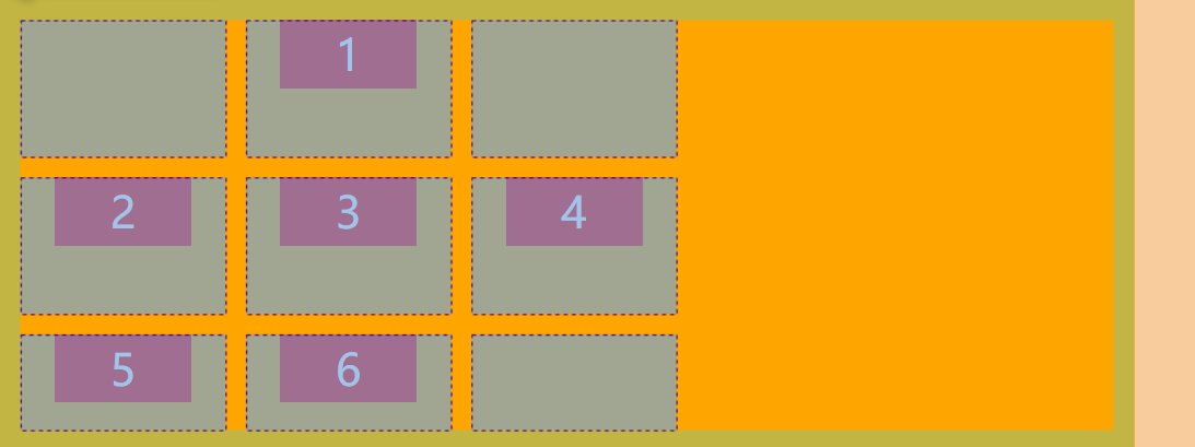
grid-auto-[columns|rows]
这两个属性声明的是编外栅格单元的高度和宽度。
编外栅格单元的宽度默认值都是 auto。也就是说,以宽度举例,如果栅格容器的宽度大于栅格系统的宽度,那编外栅格单元会平分富余空间的宽度,否则编外栅格单元就以内容的宽度为宽度了。
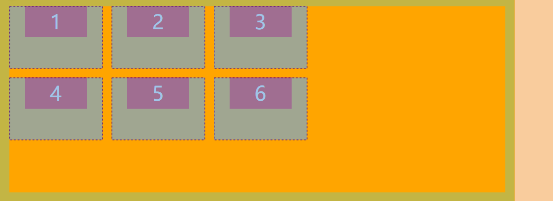
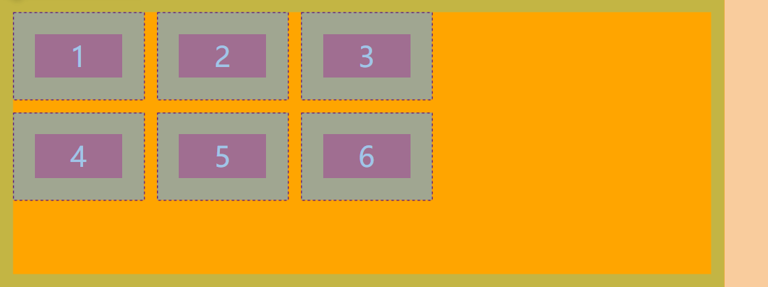
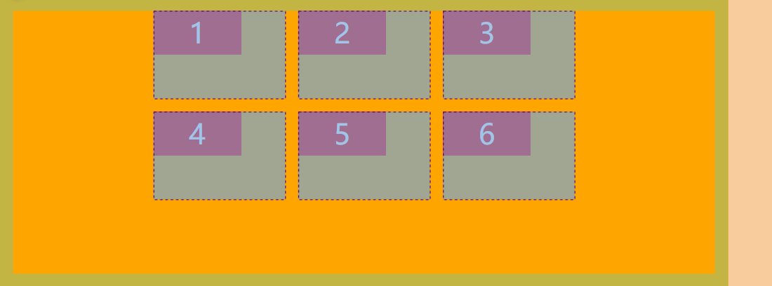
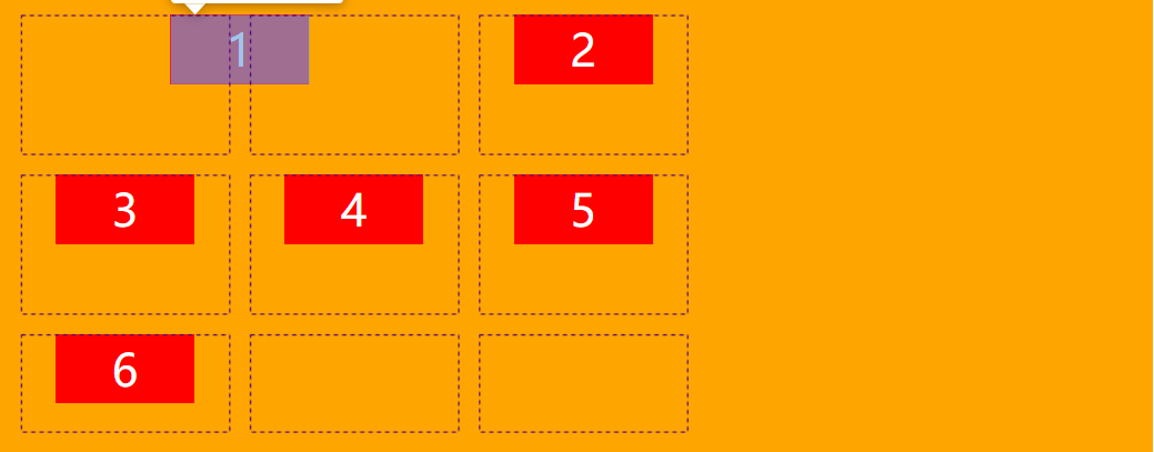
Grid-auto-flow
这个属性声明的是如果栅格项目没有明确指定在栅格容器中的位置时,栅格项目应该如何依次排列。
关于什么叫明确指定位置,栅格项目自身有一些属性,可以声明它占据的区域从哪条栅格线开始,到哪条栅格线结束,或者直接声明占据哪个栅格区域。这里按下不表,后面会讲到。
这个属性有点像 Flexbox 的 flex-direction 属性。
属性值
-
row,默认值,按行排列 -
column,按列排列.container{ display: grid; grid-template-rows: [biu-start] 100px [nothing] 100px [biu-end]; grid-template-columns: [biu-start] 150px [nothing] 150px [biu-end] 150px [nothing]; grid-column-gap: 15px; grid-row-gap: 15px; justify-content: center; grid-auto-flow:column; }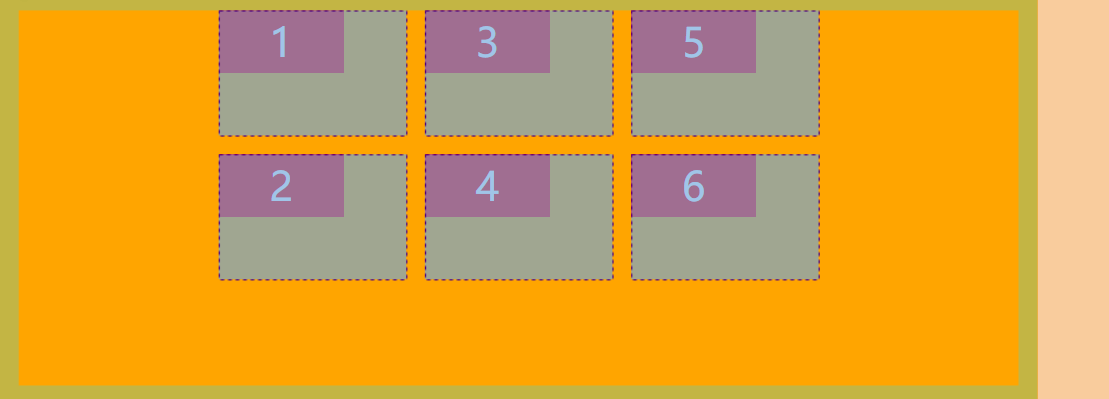
-
dense,dense翻译成中文是 稠密 的意思,它的作用是当排在前面的栅格项目由于某些原因 (主要是明确指定了位置,但是又没有占满) 空出了一些位置,后面的项目如果合身的话应不应该挤进去。
Grid
这是一个集合属性,它可以声明两大类属性中任一类的所有属性值。
.container {
    grid: <grid-template-rows> / <grid-template-columns>;
    grid: <grid-auto-flow> [<grid-auto-rows> [/ <grid-auto-columns>]];
}
以长度开头的值声明的就是第一类,以 row、column 或 dense 开头的值声明的则是第二类。
以当前 Grid Layout 的普及程度来看,尽量不要这么写,你写的费劲,别人看的费劲。
项目属性
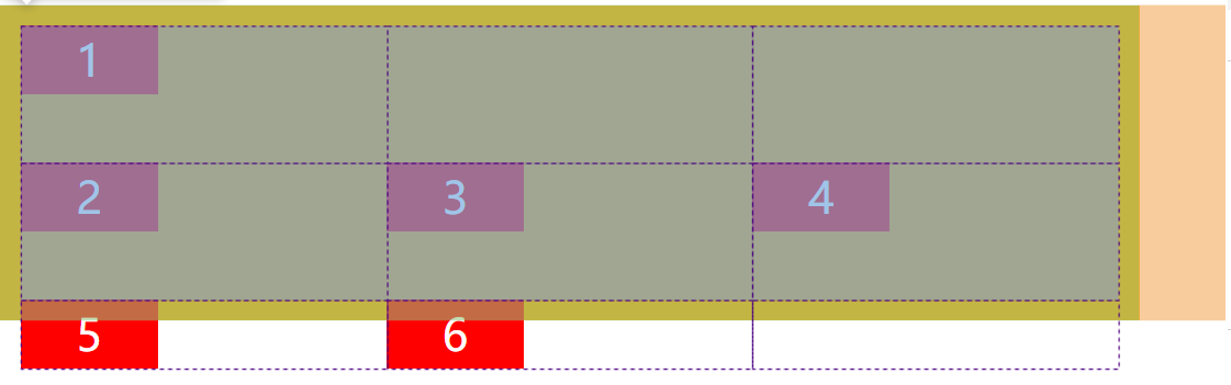
grid-[column|row]-[start|end]
这个属性声明的是指定栅格项目从哪里开始到哪里结束。
属性值
auto,指的是只占用一个栅格单元。无论从哪开始,从哪结束,只要有一个 auto 值,它就只占一个栅格单元。
<number>,指的是栅格线的顺序,从 1 开始,可以接受负值,从反向开始
.container{
  display: grid;
  grid-template-rows: [biu-start] 100px [nothing] 100px [biu-end];
  grid-template-columns: [biu-start] 150px [nothing] 150px [biu-end] 150px [nothing];
  grid-column-gap: 15px;
  grid-row-gap: 15px;
  justify-items: center;
}
.item:nth-child(1){
  grid-column-start: 1;
  grid-column-end: 3;
}
start 并不一定要比 end 靠前,靠后的话,开始到结束的方向就相反了。比如下面两段代码指定的区域是一样的。
.item {
	grid-column-start: 3;
	grid-column-end: 1;
}
.item {
	grid-column-start: 1;
	grid-column-end: 3;
}
name,指的是栅格线的名称。栅格线的名称可以从两个地方来:
- 第一是通过
grid-template-[columns|rows]显式 声明 - 第二是定义
grid-template-areas的同时会为合围的栅格线 隐式 生成xxx-start和xxx-end的名称。
.contaienr{
  display: grid;
  grid-template-rows: [biu-start] 100px [nothing] 100px [biu-end];
  grid-template-columns: [biu-start] 150px [jiu-start] 150px [biu-end] 150px [jiu-end];
  grid-column-gap: 15px;
  grid-row-gap: 15px;
  justify-items: center;
}
.item:nth-child(1){
  grid-column-start: biu-start;
  grid-column-end: jiu-end;
}
span <number> 指的是跨度为几。这里的数字不再是第几条栅格线,而是跨越几条几条栅格线。
Instead of defining a grid item based on the start and end positions of the grid lines, you can define it based on your desired column width using the span keyword. Keep in mind that span only works with positive values.
For example, water these carrots with the rule grid-column-end: span 2;.
此时 start 和 end 的优先级?一条控制开始,一条控制范围
只接受正值
span <name> 指的是跨越到该名称的栅格线为止。它和仅仅是 name 有什么区别呢?如果 start 比 end 靠后,仅仅是 name 的情况会像前面说的一样,开始到结束的方向就相反;而 span <name> 的情况则会一直往后找,毕竟找不到嘛,所以就跨越到最后一条栅格线。其中的区别在于愣头青的程度对不对?
grid-[column|row]
https://developer.mozilla.org/zh-CN/docs/Web/CSS/grid-row
这是两个集合属性,它们可以同时声明在某个方向开始和结束的位置。
.item {
    grid-column: <start> / <end>;
    grid-row: <start> / <end>;
}
使用这四个属性,如果产生了项目的重叠,则使用 z-index 属性指定项目的重叠顺序。
Grid-area
.item{
    grid-area: <name> | <row-start> / <column-start> / <row-end> / <column-end>;
}
前面介绍过 grid-template-areas 属性,它声明的栅格区域就可以被栅格项目使用了。
当然你也可以使用栅格线的方式来合围一个栅格区域,所以它也相当于 grid-[column|row]-[start|end] 的 终极集合属性。要特别注意声明的顺序
Justify-self
这个属性声明的是栅格项目的长度如果小于栅格单元的长度,栅格项目如何水平对齐。
通过它可以声明该栅格项目自身的水平对齐方式,甚至可以覆盖栅格容器 justify-items 的值。
Align-self
这个属性声明的是栅格项目的高度如果小于栅格单元的高度,栅格项目如何垂直对齐。
通过它可以声明该栅格项目自身的垂直对齐方式,甚至可以覆盖栅格容器 align-items 的值。
Place-self
place-self 属性是 align-self 属性和 justify-self 属性的合并简写形式。
Order
If grid items aren't explicitly placed with grid-area, grid-column, grid-row, etc., they are automatically placed according to their order in the source code. We can override this using the order property, which is one of the advantages of grid over table-based layout.
By default, all grid items have an order of 0, but this can be set to any positive or negative value, similar to z-index.
越大越靠后
Garden
参考:
- http://www.ruanyifeng.com/blog/2019/03/grid-layout-tutorial.html
- https://matiji.cn/post/5c98b5e8996f307d572c0a8c
FAQ
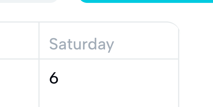
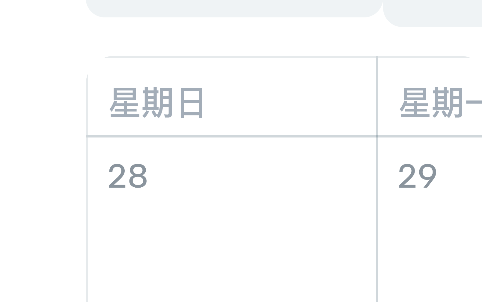
Grid 设置项目边框避免重叠
方案一: 负 Margin
直接给 item 设置 border. 然后通过 margin 负值来隐藏重叠的部分
样式控制很困难, 线的粗细是一样了. 但是颜色还是不一样, 因为有 0.5px 的线是重合的
最左侧的 item 也 margin -1px 导致整个容器视觉上都左移了 1px
.calendarGridTemplate {
  display: grid;
  box-sizing: border-box;
  width: 700px;
  margin: 0 auto;
  grid-template-rows: repeat(6, 100px);
  grid-template-columns: repeat(7, 100px);

  .gridItem {
    border: 1px solid;
    margin-left: -1px;
    margin-top: -1px;
  }
}
给项目设置 Right 和 Bottom. 给 Container 设置 Top 和 Left 即可
圆角问题. 这个时候设置圆角比如 container 和 item 都设置. 但是有时候会有微妙的偏差...
方案三: Grid-gap + Outline
Grid without double borders — Phuoc Nguyen
outline 可以重叠, 因为不占据空间.
border 不可以重叠, 因为要占据空间.
没有 gap 时, outline 不重叠, 所以 double 了. 有 gap 之后 outline 重叠
border 永远无法重叠
CSS轮廓(outline)属性详解及 outline 与 border 的区别_css中outline和border-CSDN博客
虽然粗细是一样的. 但是颜色是不一样的. 重合的线颜色明显深一点
Border-radius 问题
border-radius 是无法作用在 outline 身上的...
所以如果要加上 border-radius 使用 outline 解决重叠问题的同时, 四个角会缺一块 (overflow: hidden)
目前来看方案二是最好的方案了...